


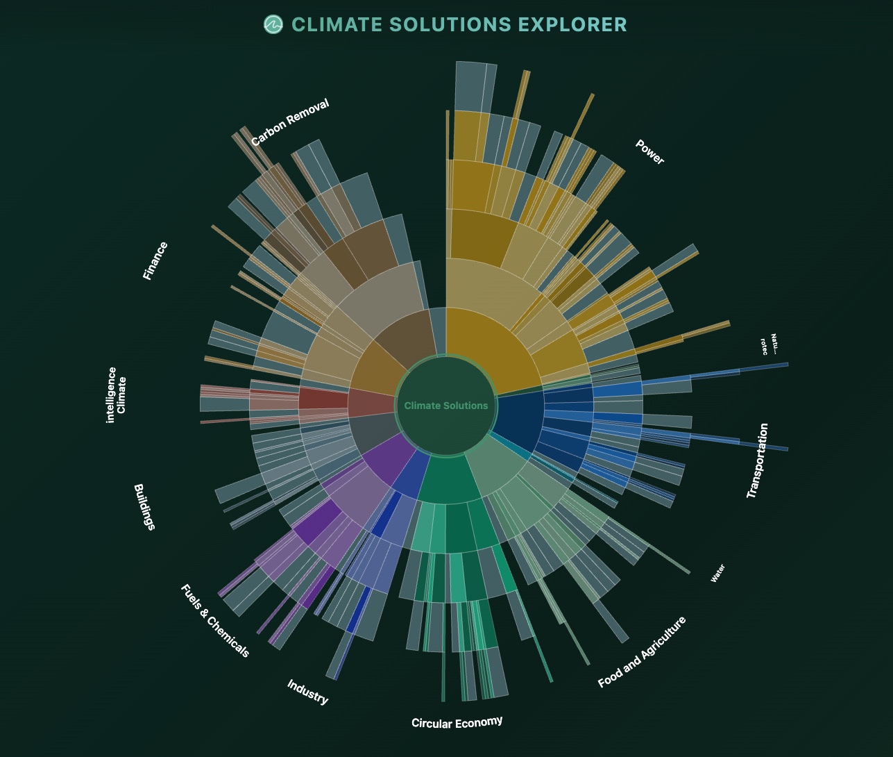
Most of you already know the Solution Map, the big overview of the climate space, 300+ solutions across 12 sectors, from power and transportation to carbon removal, nature, and finance.
It has helped a lot of people get their bearings while they work out where they fit in the climate sector. It has also helped entrepreneurs and investors find their next opportunities.
Until now it’s only ever existed as a static PDF, though we know of many people who printed it, there’s only so much you can do with it. You can read it, but you can’t follow a thread through it or pull out the parts that matter to you. Most importantly, you can’t easily find the knowledge, information, and people you are looking for.
We built the Climate Solutions Explorer to change that. It’s the same map (but a bit bigger), now interactive, so you can move through it, search it, and contribute your own entries.
The Explorer is now live at climatesolutionsmap.earth.
You can suggest/submit an entry or your own profile through the submission form, and the whole thing is open source if you want to see how it works or build on it.
Before we jump into the details let’s first answer:
Who built this?
Glad you asked!
Alon Philosof is a scientist who studied, for a decade and a half, marine microscopic life that shapes global carbon and methane cycles through photosynthesis and methane consumption. He received his PhD from the Technion and did his postdoctoral work at Caltech. His work combined extensive field work with computational genomics to trace how carbon moves through microbial systems, building new analytic tools and distilling terabytes of sequencing data to discover novel microbial groups.
He is now building Ecosphere to develop molecular tools to measure and verify carbon removal in the ocean, the “blue carbon” held in coastal and marine ecosystems. These tools provide integrity and risk scores to these projects, a way to gain credibility by showing how much carbon they’re actually removing and how resilient they are.
Alongside building Ecosphere, he is glad to hear from anyone working to make carbon removal more credible, and he is open to advisory or leadership roles where a scientist who likes to build and distill complex, multi-faceted data into a clear signal can be useful.
Now back to what the map can do now:
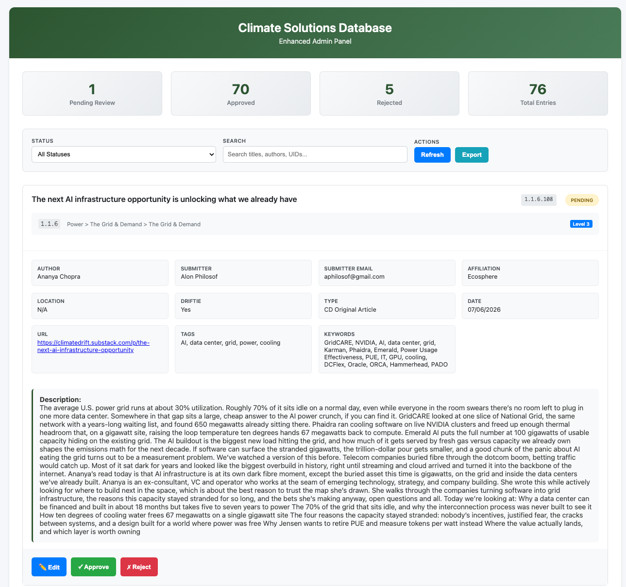
Every entry is reviewed
Everything in the Explorer is looked at and reviewed by a person before it shows up. Entries come from Drifties (at first) and get reviewed by other Drifties, so the articles, company profiles, opinion pieces, deep dives, and podcasts you find have all passed through someone who knows the field. That matters more now than it would have a few years ago.
Climate content is drowning in AI slop, and interchangeable “consultancy reports,” and this is meant to be the other thing, a deliberate, human-curated map you can trust, one that gets better every time a Driftie adds something worth keeping.
Exploring and searching
There are two ways to get around, and you’ll probably use both. If you want to explore, there are four views of the same data, and you can switch between them freely. Sunburst gives you the whole landscape at once, Bubbles lets you drop into a cluster and its sub-groups, Mosaic shows which areas are large and which are still thin, and Branches follow a single path down the hierarchy. Different views suit different questions, so it’s worth trying a few.
You’ll also notice that some entries appear in more than one place on the map, under different categories. We made that redundancy deliberate, since some solutions (and people) span more than one sector. Big problems need interdisciplinary solutions, and we hope the map makes them easier to find. As the map and dataset grow, we’ll make it even easier to find the people who can connect a solution in one sector with problems it could solve in another.
if you already know what you’re after, search handles the rest. You can look something up by keyword and narrow it by type, tag, author, location, or date, save what you find into a shortlist, and export any slice of it as data or an image. You can also download the data tables to explore them manually, if you’re a spreadsheet kind of person.
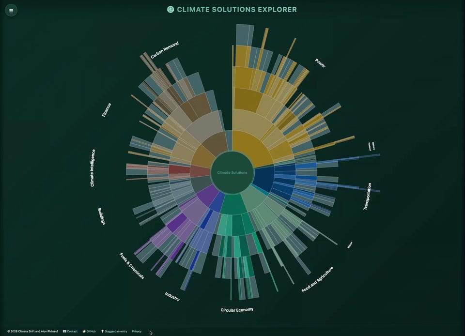
It already does a fair amount of what people have been asking for. Open any part of the map and you’ll see what’s actually there, the research and articles, company profiles, opinion pieces, deep dives, podcasts, and the people working on it. Someone weighing where in climate to focus can move through it sector by sector and see what each area holds (and what are the gaps). Someone prepping for a pitch or a new role finds the reading filed right under it. And if you’re trying to find who works on a given solution, whether in a particular place or at a particular company, that’s what the people layer is for, still small but growing.
Building on the data
The map is only the first thing you can do with this data. All of it is open, the data under a Creative Commons license and the code on GitHub under MIT.. Pull the whole dataset, or just the subset you’ve filtered down to, and use it to make your own tools, your own visualizations, or a focused dataset for a question we haven’t gotten to yet. We built one way of looking at this space. The whole thing is set up so you can build on it.
Contributing
Contributing is also how you get your own work in front of people. Along with articles and company profiles, you can submit your own profile as an entry, and it sits on the map inside the part of the climate space you work in, so you show up as part of the solution itself. That was a deliberate choice, and it’s the point of the people layer. Anyone exploring that area finds the people working there and can reach them directly.
Right now that layer is empty, since we’re not adding any personal profiles without consent. This means that if your work is on the map already, you can be among the first to be found there. So, do two things. Put your own profile on the map, so anyone looking into your corner of climate can find you and reach you.
Submit the articles, companies, podcasts, and deep dives you think belong here, the things you’d want another Driftie, employer, collaborator, or investor to find. It only takes a few minutes through the form, and while the map is still filling up, what you add shapes what everyone else sees.
Explore: climatesolutionsmap.earth
Add an entry or your own profile: submission form
The code: github.com/aphilosof/climate-solutions-explorer (open source, MIT + CC BY 4.0)
love it!